jeudi 27 octobre 2016

samedi 15 octobre 2016
DataLife Engine vs. WordPress [DataLife Engine to WordPress Migration]

DataLife Engine – Secret Possibilities
DataLife Engine – Secret Possibilities DataLife Engine is a content management system that was launched at 2004 by SoftNews Media Group. Basically, it’s focused on the blog and social-media-like website creation, however, the various website management is undoubtedly within its power.
DLE is a commercial script – you should pay for one domain $59 with purchase of 1 year license renewal and for the next year it’s $39 and $19 for additional technical support. After the purchase, you get the open source script that may be modified and customized to your wish and purpose.
DataLife Engine is used for extended web projects and is able to generate a huge amount of traffic. The key feature of this content management system is the low load on system resources. Also, the major advantage of DLE is AJAX technology, that stands for Asynchronous JavaScript And XML. This allows to save the server resources and the loading time of your website.
WordPress CMS Website – Open to World
Launched at 2003, WordPress nowadays covers 57% of market share among other CMS platforms. Because of its irreproachable simplicity as well as powerful functionality, from day to day, there are even more and more website owners who are willing to migrate their websites to this content management system.
WordPress boasts its out-of-the-box functionality and unlimited customization options. Chasing the ides of user friendly options, WP is absolutely free to use and is the speed of everyone, whether you are a web management guru or just a simple newcomer.
Furthermore, WordPress offer the endless amount of additional plugins and various theme possibilities. You may choose free or paid solutions to your wish. With WP, you are able to create a simple blogs, complicated websites, forums and other web pages.
At the end, you should choose for yourself whether to make a vault to the new page of your website management life. In the event you want to migrate your website content from DataLife Engine to WordPress, we’ve prepared a step-by-step guidance on how to do this properly and with no time and efforts wasting.

1. First, you should register a new account at cms2cms.com. Optionally, you may login via your social media profile.

2. Next, specify the URLs of your current DLE website and select the platform type. In case you just want to see how the service works, you just press the drop down menu and choose the type of the CMS platform you want to migrate to. In your case, it’s WordPress.

But, if you have already installed the new WP site, just uncheck the box and type the URL of WordPress site.
3. After that, you should establish the connection between your two sites:

4. Now, when both your sites are already connected, you may choose some extra options and start the free Demo Migration. You’ll be able to check up the results in a few minutes and proceed with the further step.

5. If you are happy with the demo migration result, press “Start Full Migration” button. Generally, the migration process takes no more that a few minutes. During the migration process your website will be available online, so you shouldn’t worry about your site visitors.

That is the whole process of DataLife Engine to WordPress migration. Thus, very soon you’ll have the opportunities to manage your new website easily in a timely manner.
DataLife Engine to WordPress Migration: Instruction

1. First, you should register a new account at cms2cms.com. Optionally, you may login via your social media profile.

2. Next, specify the URLs of your current DLE website and select the platform type. In case you just want to see how the service works, you just press the drop down menu and choose the type of the CMS platform you want to migrate to. In your case, it’s WordPress.

But, if you have already installed the new WP site, just uncheck the box and type the URL of WordPress site.
3. After that, you should establish the connection between your two sites:
- Download the bridge file to you PC and unzip it to the folder.
- Connect to your DataLife Engine and WordPress websites via FTP.
- Copy ‘cms2cms’ folder that you’ve extracted from the zip to the root directories of your DLE and WP websites.

4. Now, when both your sites are already connected, you may choose some extra options and start the free Demo Migration. You’ll be able to check up the results in a few minutes and proceed with the further step.

5. If you are happy with the demo migration result, press “Start Full Migration” button. Generally, the migration process takes no more that a few minutes. During the migration process your website will be available online, so you shouldn’t worry about your site visitors.

That is the whole process of DataLife Engine to WordPress migration. Thus, very soon you’ll have the opportunities to manage your new website easily in a timely manner.
100 Best Web Design Tools For Creative Entrepreneurs

Typography
Fontface Ninja (Free) – Identify that cool font on the page you are browsing.Google Fonts (Free) – Find and use high-quality fonts for your projects.
Adobe Typekit (Paid) – Get access to a huge bundle of premium fonts.
Fontstruct (Free) – Online font-building tool, fonts can be shared and downloaded.
Font Squirrel (Free) – One of the biggest database of free fonts.
Type light (Free) – A fully functional, OpenType font editor.
What Font is (Free) – What Font is allows you to identify the font you are looking for.
1001 Fonts (Free) – Database of almost 15.000 different fonts.
Font Flame (Free) – Tinder for font pairing. Hate it or use it.
Typecast (Free) – Create visual and semantic designs that put type first.
Stock Photos
Unsplash (Free) – 10 new photos every 10 days. FoodiesFeed (Free) – Free food photos.
Free Refe Photos (Free) – Huge list of images. Mostly landscape and nature photos.
Little Visuals (Free) – High-resolution landscape and building photos.
Gratisography (Free) – A massive database of free photos.
Death to the Stock Photo (Free) – Free stock photos to your email every month.
Superfamous (Free) – Huge collection of nature and are wider-angle shots.
The Pattern Library (Free) – A huge number of patterns and textures.
New Old Stock (Free) – Vintage photos from the public archives.
Pexels (Free) – A massive database of stock photos you can use everywhere
Stock Graphics
Brusheezy (Free) – Free Photoshop brushes, patterns, textures, and much more.Iconfinder (Free) – Search engine for free icons.
The ispot (Paid) – Premium illustrations from top level artists.
Illustrio (Paid) – Extensive library of images.
Round Icons (Paid) – The biggest icons bundle in the world.
Brushez (Free) – Huge collection of free Photoshop brushes.
Vecteezy (Free) – Huge variety of vector asset including icons and illustrations.
Webalys (Paid) – Premium icons by Vincent le Moign.
Font Bundles (Paid) – Home of premium fonts and font bundles.
GraphickStock (Free) – An unlimited number of high-quality, royalty-free photos, vectors and illustrations.
Infographics
Vizualize.me (Free) – Create your infographic or resume.Canva (Free) – A simple design tool to create anything you need.
Easel.ly (Free) – Resume and infographic templates.
Infogr.am (Free) – Online tool for infographics and interactive charts.
Visage (Free) – A simple design tool for creating visual content.
Gliffy (Free) – Online diagramming tool.
Visme (Free) – Online presentation and infographics tool with 1000′s of templates and graphics.
Piktochart (Free) – Natural infographic design to create high-quality graphics.
Draw.io (Free) – Online tool for making flow charts, process diagrams and network diagrams.
Venngage (Free) – Easy infographic maker.
Collaboration
GoVisually (Paid) – One of the top tools to collect client feedback for your projects.TrackDuck (Paid) – It allows leaving feedback right on a website or image file.
Lingo (Free) – With Lingo, you can build and share libraries of visual assets.
Red Pen (Paid) – Drag and drop your design and get the feedback from your friends.
Bounce (Free) – An easy way to share your ideas on any website.
Usersnap (Paid) – It lets you take screenshots of web pages and annotate them.
InVision (Paid) – Prototyping, collaboration and workflow platform.
Marqueed (Free) – Markup and discuss images online. Pretty useful for Photoshop.
Zeplin (Free) – Collaboration app for frontend developers and UI designers.
Cage (Free) – Nice dashboard to collaborate with team and clients.
Colors
Color Hunt (Free) – A curated collection of beautiful colors.TinEye (Free) – Determine your colors and search images with the perfect color combination.
ColorZilla (Free) – Perfect extension for picking colors from a web page.
Adobe Color CC (Free) – Generate and save various color schemes.
Coolors (Free) – Color generator for your designs.
Colicious (Free) – Just press space bar and generate new color.
Paletton (Free) – Tool for creating color combinations.
Pictaculous (Free) – Color palette generate from PNG, JPG and GIF.
Hex Color Tool (Free) – Color picking tool.
(Un)clrd (Free) – A browser extension that turns every website into black and white.
Inspiration
Dribbble – The biggest community of designers and place of their work.Muzli – Daily design inspiration.
Awwwards – The best efforts by developers, designers and web agencies in the world.
Design You Trust – Design blog and a huge community sharing latest trends, news, portfolios, fashion design, and creative ads.
Really Good Emails – Huge collection of well-designed emails.
Fubiz – One of the most popular creative publications covering the latest creative news.
Designspiration – Pinterest-style board of high-level design inspiration.
Behance – Discover the latest work from top online portfolios by creative professionals.
Mobile Patterns – A library of iOS and Android screenshots for your inspiration.
One Page Love – Gallery showcasing the best single page website designs.
Prototyping
Sketch (Paid) – The perfect tool for UI and UX design. But only compatible with Mac.Napkin (Free) – App for designing quick mocks on your iPhone.
Proto.io (Paid) – Mobile app prototyping tool that allows you to create fully interactive mobile app prototypes.
Axure (Paid) – Quickly design prototypes from your computer and share them.
Balsamiq (Paid) – Wireframing and mockup tool with a high focus on usability.
Weld (Free) – Draw your website online, just the way you want it.
POP (Paid) – Helps you to transfer your pen + paper ideas to a real working prototype.
Flinto (Paid) – Sketch interactive prototypes from static images.
HTML5 UP (Free) – Responsive and customizable HTML5 templates.
Moqups (Paid) – HTML5 based web app for making wireframes, UI designs, prototypes, and mockups.
Graphics Editors
Photoshop (Paid) – One of the best tools in the industry. Perfect for enhancing photographs, designs, and 3D artwork.Illustrator (Paid) – To build beautiful vector arts.
DAZ 3D (Free) – To create realistic humans and animals in 3D.
Gimp (Free) – Open source editor for editing and retouching images.
Blender (Free) – Open source 3D creation.
Affinity (Paid) – Photo editing tool. For Mac only.
Aviary (Free) – Photo editing mobile app for Android/iOS and the Web.
Pixlr (Free) – Online image editor.
DrawPlus (Paid) – Create amazing logos, drawings and designs, at a reasonable price.
BeFunky (Free) – Simple online photo editor.
Logo Design
Squarespace Logo (Paid) – Drag and drop logo creator.Free Logo Maker (Free) – Simple logo creator with flat icons materials.
DesignMantic (Free) – Enter company name, select your industry, and it will generate a logo for you.
Logogénie (Paid) – Logo Genie makes logo design easy and fun.
Logotype Maker (Free) – Random generates logotype for your company.
Logo Garden (Paid) – Online logo creator with hundreds of fonts and icons.
Logoshi (Paid) – Draw a messy sketch, get a modern logo.
Logaster (Paid) – Online logo maker and generator.
Logo Maker (Paid) – Generate hundreds of potential logo and modify them online.
Tailor Brands (Paid) – Quick and easy custom logo maker tool.
Source: /www.forbes.com
samedi 1 octobre 2016
Module DLE Rapid subscribe to comments

Introducing Module DLE Rapid subscribe to comments english version, after installation to subscribe to the comments will be available only when adding a comment. A simple module for the DLE «Quick subscribe to comments" replaces the standard engine algorithm Datalife Engine , so that you can subscribe to comments only by adding a comment. Dle This module complements the functionality and correct this omission.
On based hack / module "Quick subscribe to comments" users will be able to subscribe to messages just in one click. Actually the example of the execution of this button you can look at the author's website.
Installing the Quick subscribe to comments
The engine/ajax folder, create a file with the contents subscribe.php:
<?php
/*
Subscribe to comments
Author: Sander
Website: http://sandev.pro/
*/
@error_reporting ( E_ALL ^ E_WARNING ^ E_NOTICE );
@ini_set ( 'display_errors', true );
@ini_set ( 'html_errors', false );
@ini_set ( 'error_reporting', E_ALL ^ E_WARNING ^ E_NOTICE );

define( 'DATALIFEENGINE', true );
define( 'ROOT_DIR', substr( dirname(  __FILE__ ), 0, -12 ) );
define( 'ENGINE_DIR', ROOT_DIR . '/engine' );

include ENGINE_DIR . '/data/config.php';
date_default_timezone_set ( $config['date_adjust'] );

require_once ENGINE_DIR . '/classes/mysql.php';
require_once ENGINE_DIR . '/data/dbconfig.php';
require_once ENGINE_DIR . '/modules/functions.php';
dle_session();
$user_group = get_vars( "usergroup" );
if( ! $user_group ) {
    $user_group = array ();
    $db->query( "SELECT * FROM " . USERPREFIX . "_usergroups ORDER BY id ASC" );
    while ( $row = $db->get_row() ) {
        $user_group[$row['id']] = array ();
        foreach ( $row as $key => $value ) $user_group[$row['id']][$key] = stripslashes($value);
    }
    set_vars( "usergroup", $user_group );
    $db->free();
}

require_once ENGINE_DIR . '/modules/sitelogin.php';
if(!$is_logged) $member_id['user_group'] = 5;

$post_id = intval($_POST['post_id']);
if($post_id<1) die("{"error":"Undefined news for subscriptions"}");

if(!$user_group[$member_id['user_group']]['allow_subscribe']) die("{"error":"You can not use your subscription"}");

$row = $db->super_query( "SELECT id, allow_comm FROM " . PREFIX . "_post WHERE id = $post_id" );
if(!$row['id']) die("{"error":"Publication can not be found or has been removed"}");
if(!$row['allow_comm']) die("{"error":"Comments on this publication are forbidden"}");

$row = $db->super_query( "SELECT user_id, name, email, hash FROM " . PREFIX . "_subscribe WHERE news_id = $post_id AND user_id = {$member_id['user_id']}" );
if($row['user_id']){
    //un-subscribe
    $db->query( "DELETE FROM " . PREFIX . "_subscribe WHERE news_id = $post_id AND user_id = {$member_id['user_id']}" );
    echo "{"html":"You have successfully unsubscribed. Subscribe again?"}";
}else{
    //sign
    if(function_exists('openssl_random_pseudo_bytes')) $stronghash = md5(openssl_random_pseudo_bytes(15));
    else $stronghash = md5(uniqid( mt_rand(), TRUE ));
    $salt = str_shuffle($stronghash);
    $s_hash = "";
    for($i = 0; $i < 10; $i ++) $s_hash .= $salt{mt_rand( 0, 31 )};
    $s_hash = md5($s_hash);
    $db->query( "INSERT INTO " . PREFIX . "_subscribe (user_id, name, email, news_id, hash) values ('{$member_id['user_id']}', '{$member_id['name']}', '{$member_id['email']}', '{$post_id}', '{$s_hash}')" );
    echo "{"html":"You have successfully subscribed. Unsubscribe?"}";
}
JS code to insert into any pattern connected to the js file
$(document).on('click','.unsubcomm',function(){
    ShowLoading();
    var $this = $(this);
    $.post(dle_root+"engine/ajax/subscribe.php",{post_id:$('#post_id').val()},function(d){
        HideLoading();
        if(d.error) DLEalert(d.error,"Error");
        else $this.html(d.html);
    },"json");
});
In addcomments.tpl template file or fullstory.tpl at the desired location to insert the code:
[not-group=5]<span class="unsubcomm">Subscribe to comments</span>[/not-group]
If desired, use the buttons Style:
the CSS
.unsubcomm{
 display: inline-block;
 border: 1px solid #ccc;
 padding: 0 20px;
 height: 26px;
 font: normal 12px/26px Verdana;
 -webkit-box-sizing: content-box;
 -moz-box-sizing: content-box;
 box-sizing: content-box;
 cursor: pointer;
 color: #555;
 background: #e5e5e5 url(data:image/png;base64,iVBORw0KGgoAAAANSUhEUgAAAAEAAAAeCAIAAABi9+OQAAAAI0lEQVQImWP49esXEwMDA9O/f/+YGBgYmP7//4+Vj0ucTHUA3nos7QvvyugAAAAASUVORK5CYII=) repeat-x 0 0;
 -webkit-border-radius: 2px;
 -moz-border-radius: 2px;
 border-radius: 2px;
}
.unsubcomm:hover{
 color: #222;
 background: #fff url(data:image/png;base64,iVBORw0KGgoAAAANSUhEUgAAAAEAAAAeCAIAAABi9+OQAAAAG0lEQVQImWN49+4dEwMDAxMjIyNZNBMTEzn6AGFhAzKAZ4ckAAAAAElFTkSuQmCC) repeat-x 0 0;
}
.unsubcomm:active{
 border-color: #fc0;
}Regards,
Oleg aka Sander
To support the standard unsubscribe via e-mail. You can put any hash algorithm, but why, Ctrl-> C, Ctrl-> V's easier :) Download dle modules on our portal as a module Quick subscribe to comments for the DLE in the archive
Tutorial Code an animated responsive header

Learn how to create a responsive and animating page header that moves up on page scroll using JavaScript
In modern web design we see many patterns emerge such as parallax scrolling, the one page long scroll or the hamburger menu icon. But one of the patterns we often see is the animated header that animates up when the user scrolls down the page. This pattern is seen a lot on mobile devices as it helps create more of the screen for the user and is much less obtrusive.As UX design cwontinues to be at the forefront of our thinking, these kinds of patterns can only be good for us going forward. So with this in mind, we are going to create a simple tutorial that demonstrates the animated header pattern when the page is scrolled down. We will be using CSS for the styling only, but we will be putting our JavaScript hat on to create a simple but very useful script that powers the animation.
We will then make the whole page responsive so we can, if needed, see how this looks on a mobile device and test it accordingly. However, it must be said that this effect does perform much better on a desktop browser. So open up your favourite text editor and let’s get started!
1.Add the logo
Create a new HTML5 document and within the body tag, add an open and closing header element. We are then going to put our navigation in here using the HTML5 <nav> element. And within a <h1> tag, put in the text based logo, with a class name of ‘logo’.2.Create the navigation
The navigation menu will be positioned at the top left-hand side of the header, so we need to create an unordered list with four list items within it. Within these list items we will add four anchor tags with the navigation menu buttons in text.3.Responsive menu icon
We want the navigation to be responsive and that means we need to add in the hamburger icon that is associated with responsive menus. In fact, more and more designers are only using the hamburger icon and making the user click it to view other hidden buttons. But that’s beyond the scope of this tutorial. With the menu, place the hamburger icon just underneath the unordered list.
</ul>
<button class="toggle-menu" arialabel="Responsive
Navigation Menu"> </
button>
</nav><!-- end main navigation -->
</header>
4.Add the content
For the header to take effect we will need to add some content to the page. Start by adding the opening and closing <main> and then within the main tag add some paragraphs. It’s up to you how many paragraphs you add; we’ve added 11 but only shown four in the code example. If you have your own text, then great, if not then just add some Lorem Ipsum and even a few images for now.5.Scripts
This project won’t be able to function without our JS script. As you probably know, it’s good practice to always add the link to your scripts at the very bottom of the document, just above the closing body tag. And to keep things easy we will call our script, ‘scripts.js’.
<!-- My Scripts -->
<script type="text/javascript" src="scripts.
js"></script>
</body>
</html>
6.Normalize CSS
When starting a new design project, it’s always a good idea to take advantage of Normalize.css, which is a modern alternative to CSS resets. So head over to necolas.github.io/normalize.css/ and download the latest version of the software, and then add that to the head of the document, together with the link to the custom CSS file.
<!-- CSS files -->
<link rel="stylesheet" type="text/css"
href="normalize.css">
<link rel="stylesheet" type="text/css"
href="style.css">
7.Create a new CSS
Create a new CSS file and open it within your favourite text editor. We don’t need to include a long CSS reset when using normalize, but we will add a small one just to set some default styles to some elements and the body.
body,
h1,
ul {
margin: 0;}
li {
list-style-type: none;}
h1 {
font-size: 1.5rem;}
a {
text-decoration: none;
text-transform: uppercase;
color: #fff;}
/* BODY STYLES */
body {
background: #f1f1f1;
color: #272626;
font: 1em "Noto Sans", sans-serif;}
8.Set the header styles
Set the position of the header to ‘fixed’ and set the width to 100% of the browser window. Then we can apply a natural box layout model by using the ‘box-sizing: border-box’ property. Last of all, specify the colour to a light blue.The :not() pseudo class
The :not(X) property in CSS is a negation pseudo
class and accepts a simple selector1 as an
argument. Essentially, just another selector of any kind.Left
With the unordered list now styled and positioned correctly, the navigation menu is taking shape
Top left
With the header now styled, start adding some more styling to the navigation menu
Top right
Some default styles have now been added, such as the background colour, list items and hamburger icon

9.The navigation
The newest layout mode in CSS3 is flexbox, which ensures that elements behave predictably when the page layout resizes to accommodate different screen sizes and devices. To make the navigation responsive, we’re going to use flexbox in order to specify a few things, which will be discussed in more depth in the ‘In Detail’ section of this tutorial.
nav {
display: flex;
align-items: flex-end;
justify-content: space-between;
transition: align-items .3s;
}
10.Style the logo
The logo is going to be text based, however feel free to add your own logo image here. Add the ‘transition’ property to the logo whose property values will slightly change in the future. By doing this, we can achieve a smooth transition effect between the initial state and the final state.
nav {
display: flex;
align-items: flex-end;
justify-content: space-between;
transition: align-items .3s;
}
Ensure you add browser prefixes
Remember to add browser prefixes to all of the CSS properties that need them, such as the ‘transition’ property. These will provide support for the new CSS features.
Top left
Hide the hamburger icon so that it can be revealed later on when the page becomes responsive
Top right
When we drag the browser window across to change the size of the page, the hamburger icon reveals itself
Right
As the user scrolls down the header animates up and a


Learn about flexbox
The flexbox layout is a new layout module in CSS3 that ensures elements behave predictably when the page layout must accommodate different screen sizes and display devices. To use flexbox layout just set the ‘display’ property on the parent HTML element:All direct children of this element become flex items. Flexbox lets you build a ‘parent flex container’ and add sub containers inside called ‘flex items’. These dynamically adjust size by equally or proportionally distributing unused space, ensuring that the spacing of your design elements remain intact no matter what device is used to view the application.
.container {
display: -webkit-flex; /*
Safari etc*/
display: flex;
}
11.Unordered list
The next step is to display the menu items across the header. Again, use flexbox for the display mode on the ‘ul’ tag and use some margins and padding to space things out in the way you want them to look. There should be 20px of right margin on all the <li> items, apart from the last </li> <li> item, which should not have any margin.
ul {
display: flex;
margin: 50px 50px 0 0;
padding: 0;
transition: margin .2s;
}
li:not(:last-child) {
margin-right: 20px;
}
li a {
display: block;
padding: 10px 20px;
}
12. Hide the toggle menu
The toggle menu is, of course, the hamburger icon that will display when the page is resized. The icon has its own default styling and some changes need to be made so it looks simplified. We will then hide it using ‘display: none’, but will, of course, reveal it using media queries later on.13. Style the scroll class
Towards the end of this tutorial, we are going to write a short script that animates the header. In this script we will dynamically add a class to our header called ‘scroll’. So we need to add some styles to the scroll class, such as change the font size, add a drop shadow and more.
main {
display: block;
padding: 0 20px;
}
.scroller {
box-shadow: 0 8px 5px 0
rgba(0, 0, 0, .2);
}
.scroller .logo {
padding: 10px 20px;
font-size: 1.5rem;
}
.scroller nav {
align-items: center;
}
.scroller .logo,
.scroller ul,
.scroller .toggle-menu {
 margin: 0;
}
14. Make it responsive
The last piece of CSS will be the media queries. There’s nothing too complicated here, so things should look pretty straightforward. However, the only thing to mention is the toggle menu. At the moment it is specified to be hidden (display: none), but we want it to show up when the page is resized, so the display mode needs to be set to ‘display: block’.
@media screen and (max-width: 1060px) {
header {
padding: 10px;
}
nav {
align-items: center;
 }
 ul {
 display: none;
 }
 .logo {
 max-width: 130px;
 max-height: 100px;
 margin: 5px 0 0 5px;
 }
 .toggle-menu {
 display: block;
 }
15. Write the script
Create a new JavaScript file and call it ‘scripts.js’. If you remember we already included the link to this within the HTML at the bottom of the page. Open it up and first of all create what is called a ‘self-executing anonymous function’. Declare this as strict mode so that undeclared variables can’t be used.
(function() {
‘use strict’;
})();
16. Declare the variables
On a new line underneath ‘use strict’ we can define some variables. By using ‘querySelector’ we can return the first element within the document with the class names specified within the parenthesis. In this case we want to target the classes ‘main’ and ‘header’ and store them in the variables.
var main = document.querySelector("main"),
header = document.querySelector("header"),
hHeight;
17. Calculate the header height
Now let’s create a new function and call it ‘setTopHeight’ and then within this function we can calculate the headers height. Add this value as ‘paddingTop’ to the ‘main’ element. This is achieved by using the ‘offsetHeight’ property.
function setTopHeight()
{
hHeight = header.offsetHeight;
main.style.paddingTop = hHeight + "px";
}
18. Create on scroll functions
Create a new function underneath the last function, called ‘onScroll’. And then within the ‘onScroll’ function create another empty function called ‘callbackFunc’. These functions will enable us to add a class to the header when the page has been scrolled down to a certain length.
function onScroll() {
function callbackFunc() {
}}
19. Add and remove scroller class
Within the ‘callbackFunc’ function we can use the ‘pageYOffset’ property to calculate the number of pixels that the document has been scrolled vertically. However, please note this property doesn’t work in older versions of IE (IE9 or under). Now use the ‘classList’ property to add and remove the scroller class from the header.
function onScroll() {
function callbackFunc() {
var y = window.pageYOffset;
if (y > 50) {
header.classList.add("scroller");
} else
{
header.classList.remove("scroller");
}}}
20. Add the event listener
All of the code created in the last few steps will not work until an event listener is added to the function. The event we are going to be listening for is the ‘scroll’ event. We then call the ‘callbackFunc’ function and the calculation should fire, so this event listener needs to go just above the call back function.
window.addEventListener("scroll",
callbackFunc);
21. Call on our functions
To make the animation work we can call on the functions in two different ways. When the page loads, both the ‘setTopHeight’ and ‘onScroll’ functions are called, but when the browser window is resized just the ‘setTopHeight’ function is called.
window.onload = function() {
setTopHeight();
onScroll();
};
window.onresize = function() {
setTopHeight();
};
22. Recommendations
This type of effect is being applied by a lot of designers these days, adding a subtle touch to the user experience. Try this out with more content within the header and see how things look once the browser is resized.Source Tutorial & Download Files: www.filesilo.co.uk/webdesigner
TOP 5 UX design tools
Mural
Remote working is the key here. Seamlessly work within the same space as if everyone was in the same room.
Color Safe
Generate colour palettes for your projects that not only look good but are based on web accessibility guidelines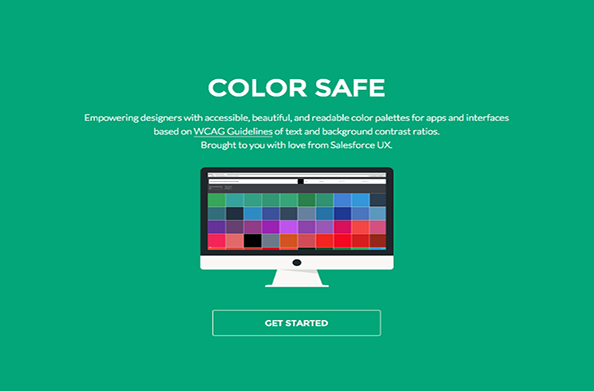
UX Pin
Manage your entire UX process with this easy tool. Design, prototype and collaborate across one platform. 
UserTesting
Customers count, and knowing how they work is critical to success. Get videos of people working to get essential insight. 
JustinMind
justinmind.comNeed prototypes? Get feature-rich design mockups and change them into fully functional UI prototypes. 
12 Best Free Anti-Spam Plugin for WordPress
1. Akismet

2. SI Captcha Anti-Spam

3. Anti-spam

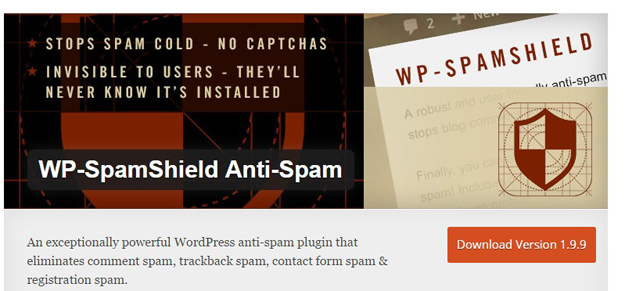
4. WP SpamShield Anti-Spam
5. Antispam Bee

6. Stop Spammers Spam Prevention

7. Advanced Invisible Anti-Spam

8. WordPress Zero Spam

9. Growmap Anti Spambot Plugin

10. NoSpamNX

11. WP Bruiser

12. Spam Destroyer

Source: https://codegeekz.com/wordpress-anti-spam-plugins/
Inscription à :
Commentaires (Atom)