Download DataLife Engine 11.2 English versionUpgrade Templates from DLE 11.1 to 11.2
Original: disk.yandex | cloud.mail.
Nulled: disk.yandex | cloud.mail.
v12
mardi 14 mars 2017
DOWNLOAD DATALIFE ENGINE 11.2 FINAL ENGLISH
Here is a new version of DataLife Engine v.11.2. This release includes Two-Factor Authentication, a new article text parser, optional display of automatic categories menu, a new safe password storage system, and many more. Now let’s have a closer look on all the new features of a new version...
samedi 21 janvier 2017
Quite Simple POP Up Subscription Widget Blogger
POP Up Subscription Widget FeedBurner from Blogger
Istallation is Quite Simple and eassy. Hardly Take a Minutes to install it. All is just for free.
Installation :
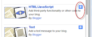
Go to Blogger Dashboard → Layout → Add a Gadget → HTML/javaScript Gadget
Copy the Code given Below and Paste it directly into your HTML/javaScript Gadget box.
Customization
Change the coderdesire with your feedburner Name.
Change this Blue Colored TAG Line with Your TAG line.
Istallation is Quite Simple and eassy. Hardly Take a Minutes to install it. All is just for free.
Installation :
Go to Blogger Dashboard → Layout → Add a Gadget → HTML/javaScript Gadget
Copy the Code given Below and Paste it directly into your HTML/javaScript Gadget box.
<div id='om-pqj3zwq5bz-lightbox' style='float:center; position: fixed; z-index: 7371832; top: 0px; left: 0px; zoom: 1; width: 100%; height: 100%; margin: 0px; display: block;'>
<link href='https://googledrive.com/host/0B8718NweZNbCSDlHdjNscDE2VHM' rel='stylesheet' type='text/css'/>
<form action='http://feedburner.google.com/fb/a/mailverify?uri=coderdesire' method='post'><div class='om-lightbox-case-study-theme om-clearfix' id='om-lightbox-case-study-theme-optin' style='top: 56.5px; left: 281.5px; display: block;'><div class='om-clearfix' id='om-lightbox-case-study-theme-optin-wrap'><a href='javascript:void(0)' id='om-close' onclick='document.getElementById('om-pqj3zwq5bz-lightbox').style.display='none';document.getElementById('om-pqj3zwq5bz-lightbox').style.display='none'' title='Close'></a><div class='om-clearfix' id='om-lightbox-case-study-theme-optin-bar'><span class='om-bar om-red-bar'></span><span class='om-bar om-green-bar'></span><span class='om-bar om-orange-bar'></span><span class='om-bar om-blue-bar'></span></div><div class='om-clearfix' id='om-lightbox-case-study-theme-header'><h1 class='om-clearfix' id='om-lightbox-case-study-theme-optin-title' style='font-family:'Bree Serif', sans-serif;font-size:50px;font-weight:normal;font-style:normal;text-decoration:none;'>How To Become a Pro Blogger</h1><h2 class='om-clearfix' id='om-lightbox-case-study-theme-optin-tagline' style='color:#8e8e8e;font-size:24px;font-weight:normal;font-style:italic;text-decoration:none;'>GET NEW BLOGGING TIPS DIRECTLY TO YOUR INBOX</h2></div><div class='om-clearfix' id='om-lightbox-case-study-theme-content'><div id='om-lightbox-case-study-theme-content-clear'><div id='om-lightbox-case-study-theme-left'><div id='om-lightbox-case-study-theme-optin-image-container'><img alt='case-study-png' class='attachment-full wp-post-image' src='https://blogger.googleusercontent.com/img/b/R29vZ2xl/AVvXsEjJRiNfqMFJEhajQ-EFafBf_0CXzXaIVwEB6RVYfDyfZgwBdo0FwRjMmRhaQB8tpHMK4sCp2JRS0htDohhsSfBCJtd9J7GzSb6pwDHS_rM3bgm8BNOielRddxSloSMXy_72ox9xyET8cUg/s1600/Pre-Mail_256x256.png'/></div></div><div class='om-has-name-email' id='om-lightbox-case-study-theme-right'><img alt='Arrow' id='om-lightbox-case-study-theme-arrow' src='http://optinmonster.com/wp-content/plugins/optin-monster/inc/css/images/case-study-arrow.png'/><input id='om-lightbox-case-study-theme-optin-name' placeholder='Enter Your Name' style='font-weight:normal;font-style:normal;text-decoration:none;text-align:left;' type='text' value=''/><input id='om-lightbox-case-study-theme-optin-email' placeholder='Enter Your Email' style='font-weight:normal;font-style:normal;text-decoration:none;text-align:left;' type='email' value=''/><input id='om-lightbox-case-study-theme-optin-submit' style='background-color: rgb(120, 172, 6); border-color: rgb(120, 172, 6); font-family: 'Bree Serif', sans-serif; font-size: 22px; font-weight: normal; font-style: normal; text-decoration: none; text-align: center; height: 58px; line-height: 36px;' type='submit' value='Grab Free Resources Now'/></div></div></div></div></div><script type='text/javascript'>function om_js_pqj3zwq5bz_lightbox(){this.init = function($){this.resize_element($, "div#om-pqj3zwq5bz-lightbox #om-lightbox-case-study-theme-optin");},this.resize_element = function($, el){$(el).css({ top: ($(window).height() - $(el).outerHeight()) / 2, left: ($(window).width() - $(el).outerWidth()) / 2 });$(window).resize(function(){$(el).css({ top: ($(window).height() - $(el).outerHeight()) / 2, left: ($(window).width() - $(el).outerWidth()) / 2 });});}}</script></form></div>Customization
Change the coderdesire with your feedburner Name.
Change this Blue Colored TAG Line with Your TAG line.
10 Free UI Kits for Designers
10 Free UI Kits that will help you with references and ideas for your next projects, be flat or not, these UI kits are really awesome and easy to edit and use.
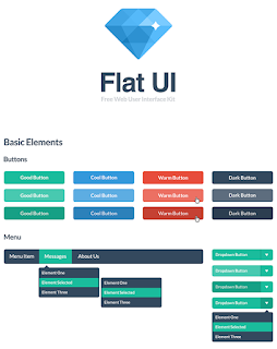
UI Kit: Flat UI
You will find in this package buttons and icons, glyphs, color samples and typography examples. This is all for free. However, if you would like to upgrade to a Pro Kit, Designmodo has an offer for you too.
UI Kit: EventPro
A UI Kit with an elegant and clean look on the elements, this kit is related to events and organization. Simple – yet powerful – user controls, EventPro allows users to Pin content, manage items, track balances, gather statistics and makes it easy to keep track of your ticket sales, your users and their interactions with your upcoming event.
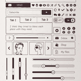
UI Kit: Basiliq
With over 300 exclusive prototyping elements, this is a Freehand UI Kit that is very complete. There are high-quality icons, that everybody loves and a set of hand-crafted icons for mockups as well.
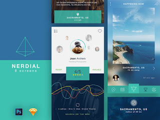
UI Kit: Nerdial
Nerdial App UI was projected with the current trends like thin lines and big pictures, flat colors, transparent shapes and defined icons. This 8-screen kit comes with a Photoshop and Sketch version.
UI Kit: Ecommerce
This app is for personal use, commercial and non-commercial organization, to sell and/or share your accessories and wardrobe. It’s very simple and minimalist for the end user.
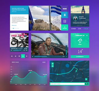
UI Kit: Personal Dashboard
This Kit is very diverse. Colored flat and simple UI Kit released on Dribbble. In the PSD file, you will find common elements such as video player, buttons, graphics and statistics, social and text elements.
UI Kit: iOS Components
Components of the User interface where the concept of apps was based on the iOS design. All the elements are vectorial shapes totally editable included in a unique PSD file which is very well organized. UI components based on iOS 7 visual guidelines. All elements are completely editable vector shapes, included in a single PSD file.
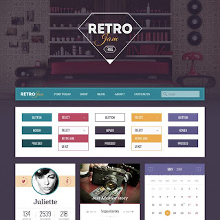
UI Kit: Retro Jam
Retro style is still a strong trend in graphic design and Retro Jam inspires follows this trend. There are two versions, the smaller that is free and the paid one.
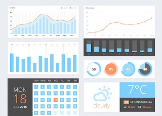
UI Kit: UI Components
This kit is all about 3D charts and graphics but there are other UI components. All the components are vectors and fully editable. You can easily plug them into your dashboards or mobile app designs.
UI Kit: Colorful Tiles
This kit has a modern style and its main focus is on color and vivacity in graphs, buttons, icons and other components.
Source:http://spyrestudios.com/top-10-free-ui-kits-of-2016/
Source:http://spyrestudios.com/top-10-free-ui-kits-of-2016/
mercredi 11 janvier 2017
Free Clipped SVG Slider
Simple slider, with morphing preview images animated using SVG properties.
Structure
The HTML structure is composed of three unordered lists: a
Each list item inside the
Adding style
By default, all the list items inside the
The
The
When a new slide is selected, the
The same classes are also used to control the visibility/position of the image captions. By default, all captions are hidden and moved to the right; the class
Events handling
To implement this slider we created a
The
Structure
The HTML structure is composed of three unordered lists: a
ul.gallery and a ul.navigation for the slider images and navigation, and a ul.caption for the image captions.Each list item inside the
ul.gallery is composed of a .svg-wrapper element wrapping a <svg> containing a <clipPath> element (used to change the clipping area of the slide image), an <image> element (whose clip-path url attribute is the<clipPath> id), and a <use> element (whose xlink:href attribute is the<clipPath> id) used to create the layer covering the slide images not in the center.<div class="cd-svg-clipped-slider" data-selected="M780,0H20C8.954,0,0,8.954,0,20v760c0,11.046,8.954,20,20,20h760c11.046,0,20-8.954,20-20V20 C800,8.954,791.046,0,780,0z" data-lateral="M795.796,389.851L410.149,4.204c-5.605-5.605-14.692-5.605-20.297,0L4.204,389.851 c-5.605,5.605-5.605,14.692,0,20.297l385.648,385.648c5.605,5.605,14.692,5.605,20.297,0l385.648-385.648 C801.401,404.544,801.401,395.456,795.796,389.851z">
<div class="gallery-wrapper">
<ul class="gallery">
<li class="left">
<div class="svg-wrapper">
<svg viewBox="0 0 800 800">
<title>Animated SVG</title>
<defs>
<clipPath id="cd-image-1">
<path id="cd-morphing-path-1" d="M795.796,389.851L410.149,4.204c-5.605-5.605-14.692-5.605-20.297,0L4.204,389.851 c-5.605,5.605-5.605,14.692,0,20.297l385.648,385.648c5.605,5.605,14.692,5.605,20.297,0l385.648-385.648 C801.401,404.544,801.401,395.456,795.796,389.851z"/>
</clipPath>
</defs>
<image height='800px' width="800px" clip-path="url(#cd-image-1)" xlink:href="img/img-01.jpg"></image>
<use xlink:href="#cd-morphing-path-1" class="cover-layer" />
</svg>
</div> <!-- .svg-wrapper -->
</li>
<li class="selected">
<div class="svg-wrapper">
<svg viewBox="0 0 800 800">
<title>Animated SVG</title>
<defs>
<clipPath id="cd-image-2">
<path id="cd-morphing-path-2" d="M780,0H20C8.954,0,0,8.954,0,20v760c0,11.046,8.954,20,20,20h760c11.046,0,20-8.954,20-20V20 C800,8.954,791.046,0,780,0z"/>
</clipPath>
</defs>
<image height='800px' width="800px" clip-path="url(#cd-image-2)" xlink:href="img/img-02.jpg"></image>
<use xlink:href="#cd-morphing-path-2" class="cover-layer" />
</svg>
</div> <!-- .svg-wrapper -->
</li>
<!-- other slides here -->
</ul>
<nav>
<ul class="navigation">
<li><a href="#0" class="prev">Prev</a></li>
<li><a href="#0" class="next">Next</a></li>
</ul>
</nav>
</div>
<ul class="caption">
<li class="left">Lorem ipsum dolor</li>
<li class="selected">Consectetur adipisicing elit</li>
<!-- other captions here -->
</ul>
</div> <!-- .cd-svg-clipped-slider -->Adding style
By default, all the list items inside the
ul.gallery have a position absolute, an opacity of zero and are moved to the right and scaled down. .cd-svg-clipped-slider .gallery li {
/* slider images */
position: absolute;
z-index: 1;
top: 0;
left: 25%;/* (100% - width)/2 */
width: 50%;
height: 100%;
opacity: 0;
transform: translateX(75%) scale(0.4);
transition: opacity .3s, transform .3s ease-in-out;
}The
.selected class is then used to move the selected image back to the center and to scale it up..cd-svg-clipped-slider .gallery li.selected {
/* slide in the center */
position: relative;
z-index: 3;
opacity: 1;
transform: translateX(0) scale(1);
}The
.left and .right classes are used to show the preview images on both sides of the selected image; the .left class is also used to move an image preview to the left..cd-svg-clipped-slider .gallery li.left {
/* slides on the left */
transform: translateX(-75%) scale(0.4);
}
.cd-svg-clipped-slider .gallery li.left,
.cd-svg-clipped-slider .gallery li.right {
/* .right -> slide visible on the right */
z-index: 2;
opacity: 1;
}When a new slide is selected, the
<path> element used to clip the slide image is animated to reveal a different portion of the image (the entire image if the slide is the .selected one, or just a section for the .left/.right images).The same classes are also used to control the visibility/position of the image captions. By default, all captions are hidden and moved to the right; the class
.selected is used to show the selected caption and move it back to the center, while the .left class is used to hide it and move it to the left..cd-svg-clipped-slider .caption li {
/* slide titles */
position: absolute;
z-index: 1;
top: 0;
left: 0;
text-align: center;
width: 100%;
transform: translateX(100px);
opacity: 0;
transition: opacity .3s, transform .3s ease-in-out;
}
.cd-svg-clipped-slider .caption li.selected {
/* slide visible in the center */
z-index: 2;
position: relative;
transform: translateX(0);
opacity: 1;
}
.cd-svg-clipped-slider .caption li.left {
/* slide hidden on the left */
transform: translateX(-100px);
}Events handling
To implement this slider we created a
svgClippedSlider object and used the bindEvents method to attach event handlers for the click to the slider navigation.function svgClippedSlider(element) {
this.element = element;
this.slidesGallery = this.element.find('.gallery').children('li');
this.slidesCaption = this.element.find('.caption').children('li');
this.slidesNumber = this.slidesGallery.length;
this.selectedSlide = this.slidesGallery.filter('.selected').index();
// ....
this.bindEvents();
}
svgClippedSlider.prototype.bindEvents = function() {
var self = this;
//detect click on one of the slides
this.slidesGallery.on('click', function(event){
if( !$(this).hasClass('selected') ) {
//determine new slide index and show it
var newSlideIndex = ( $(this).hasClass('left') )
? self.showPrevSlide(self.selectedSlide - 1)
: self.showNextSlide(self.selectedSlide + 1);
}
});
}The
showPrevSlide and showNextSlide methods take care of showing the selected slide; these functions are used to add/remove the proper classes from the slide images and captions, and to animate the ‘d’ attribute of the <path> element inside the <clipPath> used to clip the slide image.
mardi 10 janvier 2017
TOP 5 CSS Grid and Layout Tools
Responsive Grid
A quick and easy way to create a straightforward responsive grid. Set number of columns and margin; collect your code.
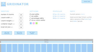
Gridinator
Add your columns number, set margins, font size and the widths measurement to use. Get a HTML and CSS template
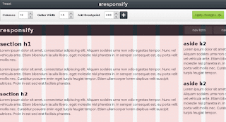
Responsify
Choose number of columns needed, gutter width and add in breakpoints. Apply changes and download the template.
LostGrid
Lost Grid is a grid system that is built in PostCSS (postcss.org). It works with any preprocessor and vanilla CSS.
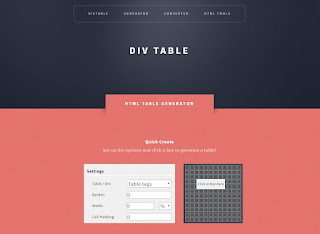
Divtable
Quickly generate any size grid you like. This tool uses table or div tags (you choose). Then select columns and rows.
lundi 9 janvier 2017
TOP 5 Photoshop Plugins For Web Designers
CSSHat2
Get the CSS code quickly and easily for individual layers In a design without the hassle of having to hand code.
Pictura
Quickly get the image you want to add to a design. Pictura searches, locates and lets users utilise images from Flickr.
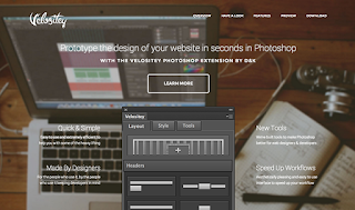
Velositey
Need to create a prototype quickly? This extension allows for quick creation and is compatible with Bootstrap.
Flaticon
You are almost guaranteed to need an icon at some point. Use this plug in to quickly find the ideal option.
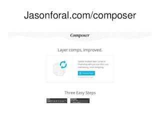
Composer
Working with multiple layers can be time-consuming. Improve your workflow with multilayer renaming and more.
10 Must Know Google Analytics Tips
Create goals
Goals will help you to determine the success of your website; use goals to measure how often users complete specific actions on your website that contribute to the success of your business. You also have the option of assigning a monetary amount to the conversions.
Implement event tracking
Add event tracking to collect data about interactions with your website content. Events are user interactions with content that can be tracked independently from a webpage or a screen load. This can be pages, external links, PDF downloads and form submissions.
Custom alerts
Google Analytics provides a way to automatically track variations in key metrics for your website. Custom alerts monitor traffic and goals and notify you of issues. For example, email or SMS alerts can be sent when triggers are activated, acting as your contingency to ensure action is taken should traffic drop
Demographics
Activate the demographics report to understand your audience composition in terms of gender, age and interests. This very powerful data at your fingertips will help you to understand the kind of creative content to develop, media buys to make, and audiences to develop.
Google Tag Manager
This free tool makes it easy for marketers to add and update website tags, including conversion tracking, site analytics and remarketing. With just a few clicks, and without needing to edit your website code, you are able to streamline your implementation.
Cross domain tracking
If you have a subdomain, don’t forget to implement cross-domain tracking to maintain the original source. This feature makes it possible for analytics to see sessions on two related sites (such as an eCommerce site and a separate shopping cart site) as a single session.
Filters
Filters can be used to include and exclude subsets of traffic, and set up your filters and self-referrals to limit and modify the data that is included in a view. For example, you can use filters to exclude traff ic from internal IP addresses, self-referrals payment gateways and referral spam.
404 pages
Tracking errors is also important to monitor the health of your site and keep track of signals indicating a negative user experience. Tracking 404 (missing) pages to identify them in a custom report and actively how many users experienced this is crucial to actively cleanse and redirect such pages.
Funnel tracking
Measuring conversions is crucial for any online brand. Simply measuring the final conversion point doesn’t tell the full story for many sites. Setting up funnel tracking highlights the steps a visitor needs to take before reaching the conversion. You can see where roadblocks are and optimise your funnel better
Ecommerce tracking
This allows you to measure the transactions and revenue your website generates. You typically implement it once the user has completed the checkout process. You can then correlate sales data with site usage data like sessions, bounce rate and traffic source/medium.
Inscription à :
Articles (Atom)
